Elections Alberta Case Study | Accessible Web Design
Challenge
Creating an online hub for election information
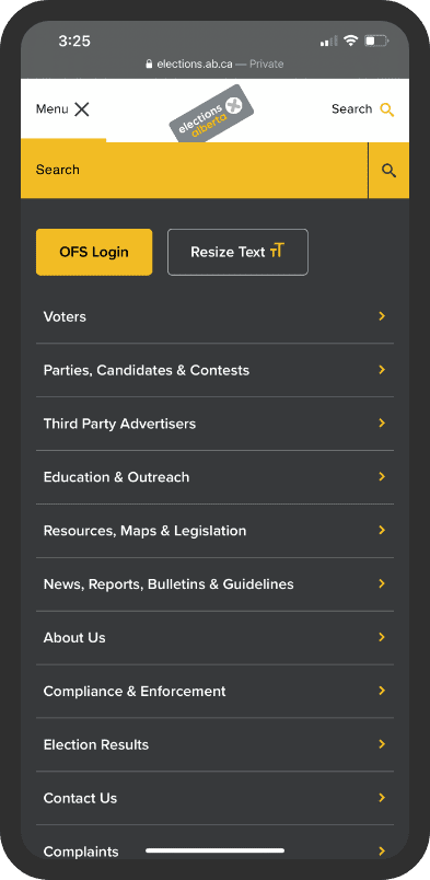
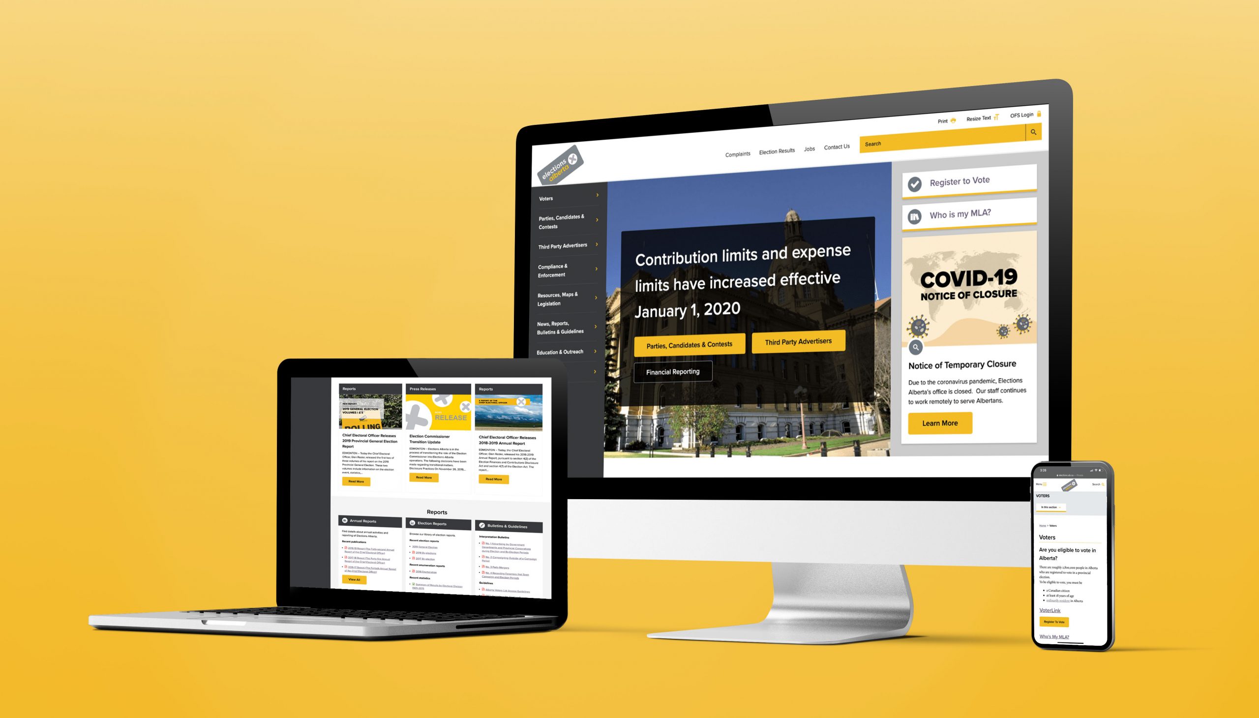
In a province immersed in the digital age, Elections Alberta understood the value of improving their website’s navigation and mobile responsiveness.
That’s why they partnered with us for a complete content, design and development overhaul.
Services
Solution
Mobile-friendly and accessible for democracy
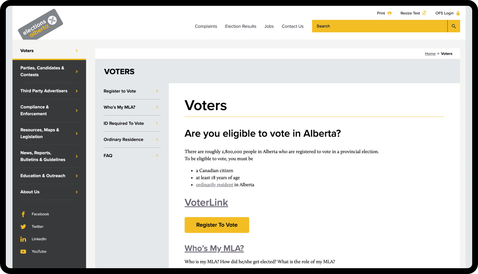
The Elections Alberta website had to feature valuable content and be mindful of all citizens legal to vote.
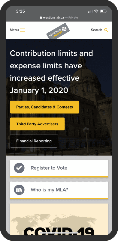
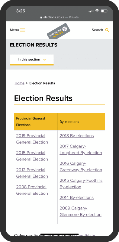
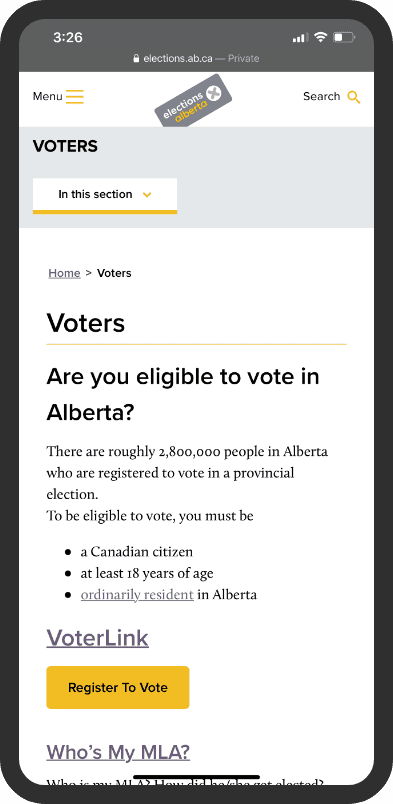
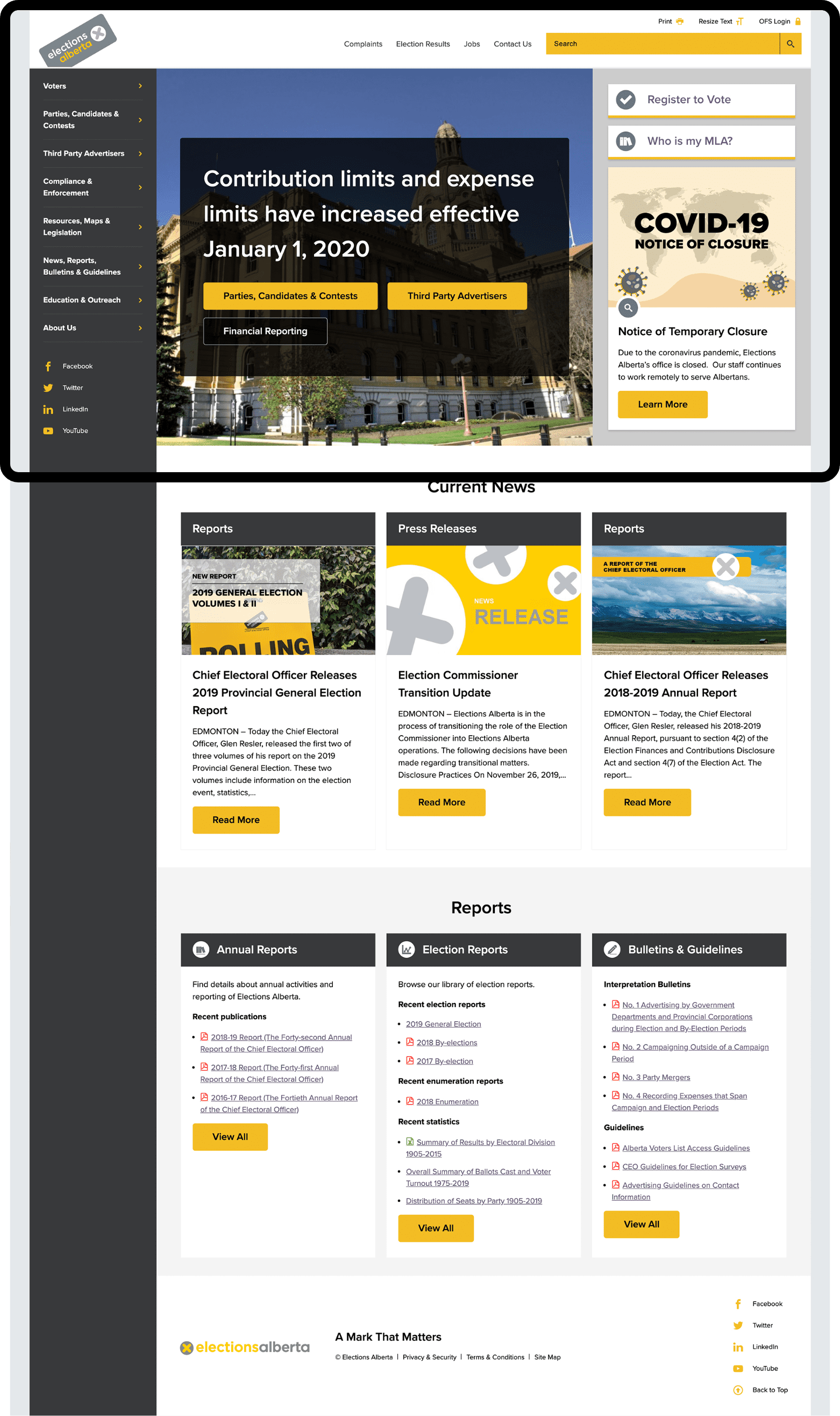
With Web Content Accessibility Guidelines (WCAG) 2.0 in mind, we selected scannable fonts, developed screen reader functionality and ramped up loading speeds. The mobile design is flexible enough to be displayed on tablets at voting stations.
Assessing and analyzing content
Our team performed an in-depth audit of Elections Alberta’s previous website, analyzing visitor behaviours to inform content and design decisions.
From this audit, we designed the website with the utmost care and concern for non-partisan information and clarity for all citizens of Alberta.
Election and non-election mode
When an upcoming election is automatically detected, the website transforms to display candidate profiles and voting station maps.
When no election is in progress, the website defaults to information about MLAs and news updates.
-
302,000+annual sessions
-
45.11%bounce rate
-
57.42%mobile visitors
Results
Informing and educating the public
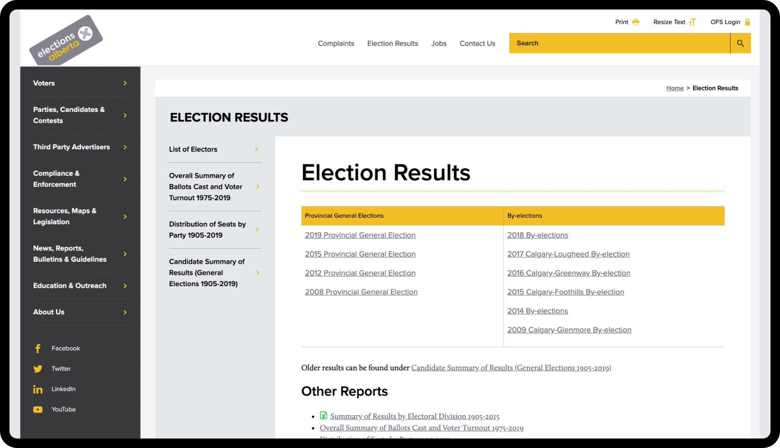
Over the last 5+ years, team has had a successful partnership with Elections Alberta. We’re constantly enhancing the website navigation and keeping an eye on accessibility guidelines.
The continual evolution of the Elections Alberta website ensures as many people as possible can vote and participate in our democracy.
