Edmonton International Airport: Accessible Website Redesign & Digital Transformation Case Study
Challenge
8.2 million travellers—and growing
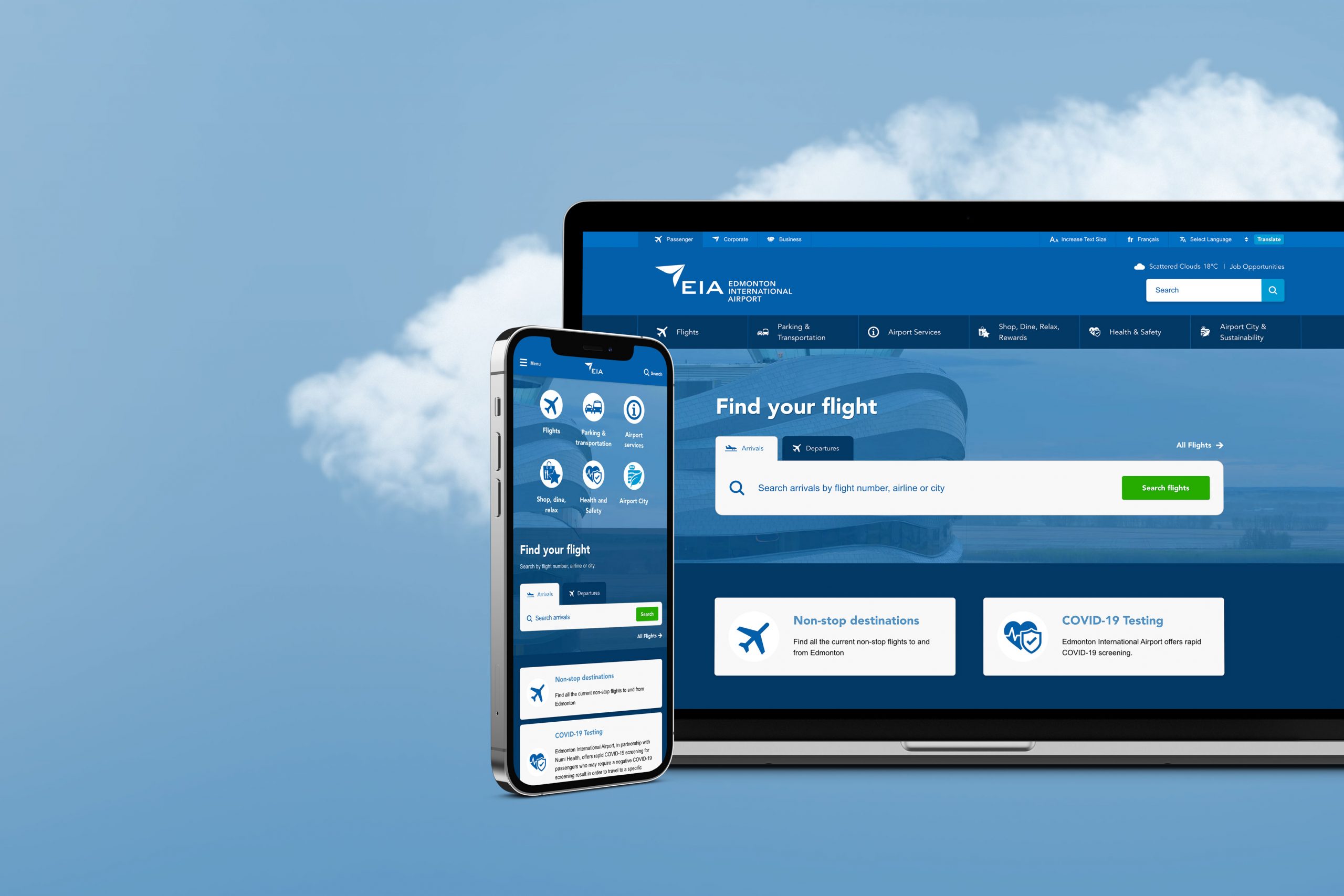
EIA needed a modern website that would meet its digital transformation goals. As a vital hub for flights, shopping and business, the airport’s new online presence had to function for both everyday passengers and global corporations.
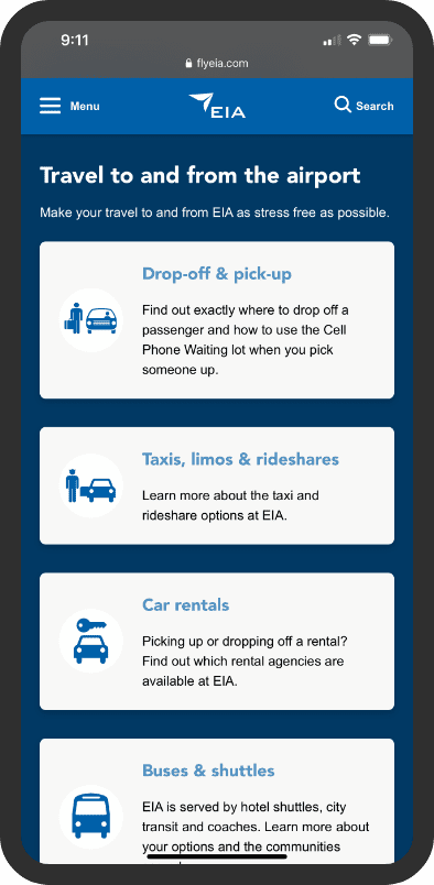
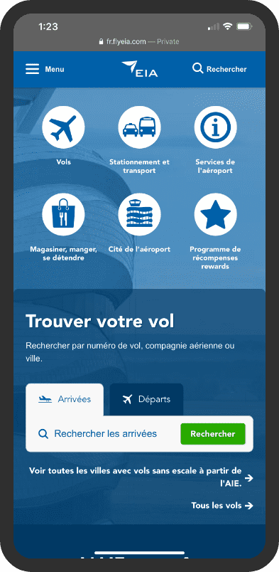
Mobile-first and accessible design were huge factors for EIA, so people of all abilities could navigate the website with ease.
Services
Solution
Accessible website design
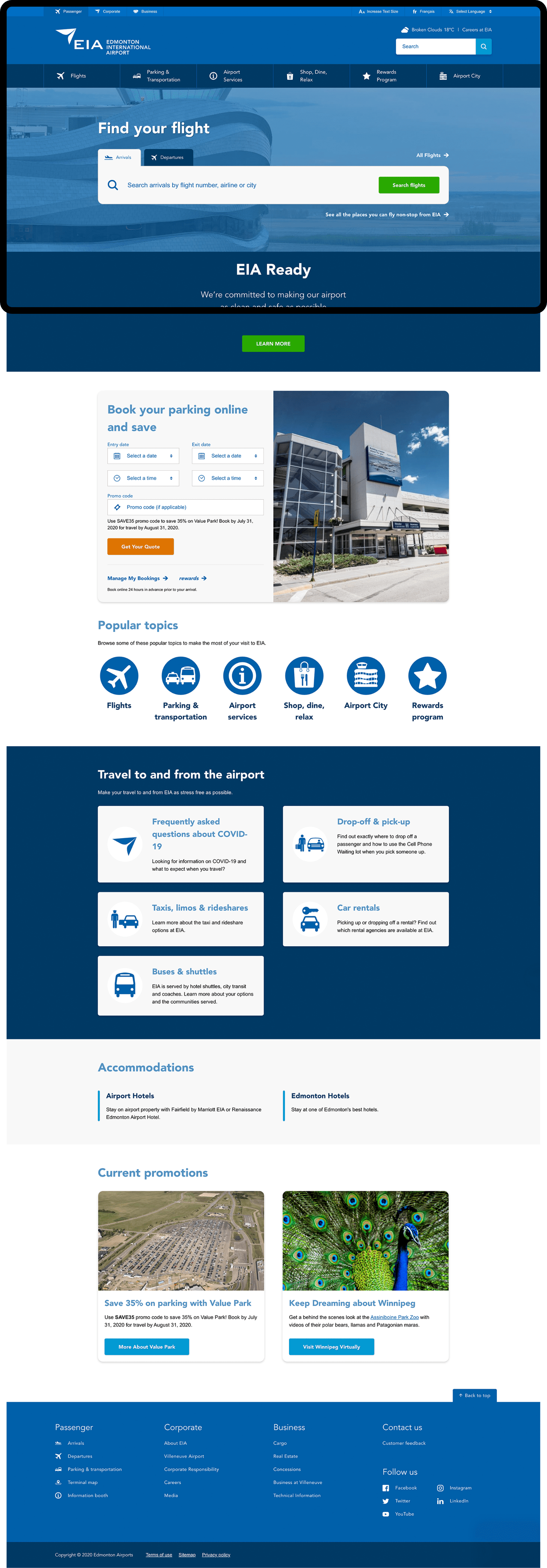
Crafted with the needs of diverse populations in mind, the new EIA website offers a streamlined, user-friendly experience. Our design follows Web Content Accessibility Guidelines (WCAG) 2.1, adhering to standards for site structure, labelling, descriptions, navigability, font sizes, colours, buttons and charts.
Finding the right flights
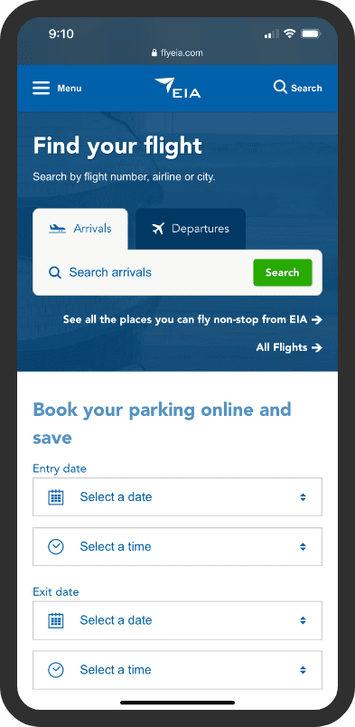
Users can search for arrivals and departures right on the EIA website. An auto-complete function matches keywords with relevant airlines. A streamlined flight chart with colour coding allows travellers to easily find important details, exactly when they need it.
Customer loyalty software
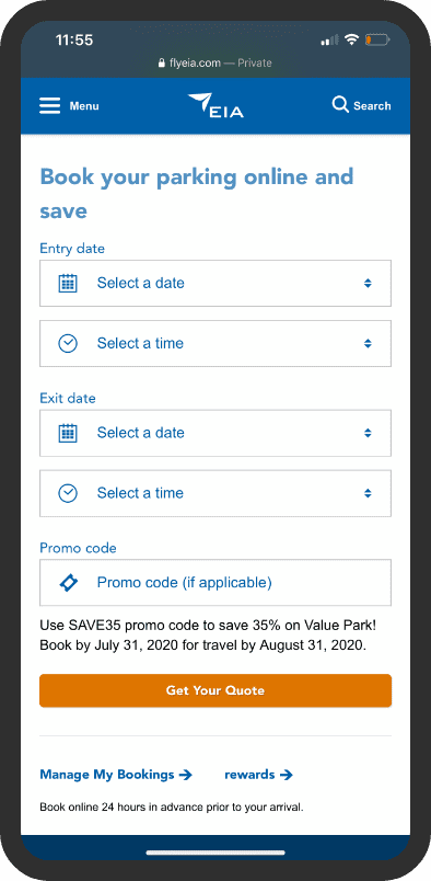
Our smart technology gives EIA the power to create promotional ads for their rewards program. All results are trackable through custom analytics, so the team can optimize and improve their marketing efforts.
Sky-high business opportunities
EIA has become a bustling launchpad for economic growth. Knowing entrepreneurs were an important audience, we created separate corporate and business sites to complement the passenger website. Users can toggle between each to find the content that fits their needs.
-
3.5 million+annual sessions
-
67%new visitors
-
22,000+passengers per day
“Our vision for our website was a visually appealing, easy-to-navigate product that was accessible for all our passengers. Top Draw met all our expectations, and we’re incredibly proud to showcase their work to our local, national and international stakeholders.”
—Liz Dwernychuk, Director, Digital Program, Edmonton International Airport
Results
Handing over the controls
Now, EIA has a powerful digital platform that will evolve with freedom and flexibility. The design displays perfectly on mobile devices, and the UX operates seamlessly.
Before and after launch, we’ve held extensive training sessions to give EIA confidence when updating content. To keep the team aligned with WCAG 2.1, we provided a comprehensive manual of website tips and best practices, as well as in-person training.
